Hello Crafters! I'm happy to be back today as a guest blogger for Scrapbook.com with some projects and ideas to inspire you. In honor of Scrapbook.com's 20th Anniversary, I thought it would be fun to design some trendy and masculine anniversary cards for your favorite fellas.
Let's get some throwback vibes going and get started on two hip cards for the handsome guy in your life!
 If you follow recent design trends, then you know that the Mid-Century Modern aesthetic is making a comeback in a big way.
Those fun, quirky shapes and color palettes are just perfect for masculine card designs! I really am obsessed with this style and was excited to see that Scrapbook.com had exactly what I needed to make my ideas come to life.
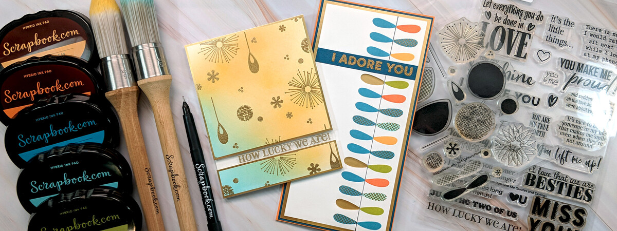
This first card design draws on a lot of different trends – ink blending, window cutouts, and Mid-Century Modern. The mix of earthy colors and gold brushed metallics is a hallmark of this iconic style.
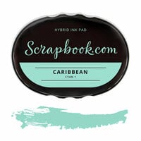
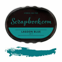
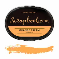
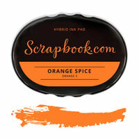
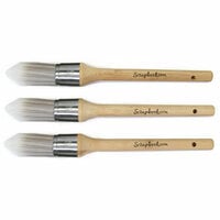
 I started by creating a blended panel using Caribbean, Lagoon Blue, Orange Spice, and Orange Cream hybrid inks. The Scrapbook.com blending brushes helped make the panel come together quickly and in a controlled way.
By blending a bit of Caribbean into the Orange Cream, I created a greenish hue that looked amazing!
Card Making Tip: Instead of blending on a pre-cut card front or panel, just grab a large piece of smooth cardstock and just start blending away. That way you can blend on a larger surface area and decide later which is the best spot to cut your card from! Genius!
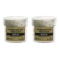
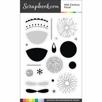
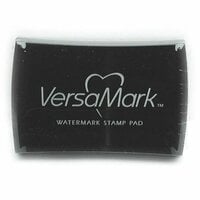
 Then, it was a matter of stamping the pattern. I picked one stamp at a time from the Mid-Century Floral Set. I used VersaMark ink and gold embossing powder, heat embossing until I was happy with the outcome. Then I moved on to the next stamp to create a fun, random pattern.
Don't forget to use an anti-static bag in between each stamp and emboss cycle so that your images are super clean and clear!
Once I was happy with the blending and stamping, I cut the panel down to 4 ⅛" x 5 ⅜". This is slightly smaller than the size of the finished card so that we can add a bright, shiny matting around it. Next, we're going to create a fun, clear window through it with our sentiment!
Stamping Tip: Look beyond the intended use of a stamp set. Though the featured set is called Mid-Century Floral, the individual shapes can create great patterns that don’t look “flowery”.
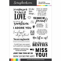
 I personally love the You and Me Quotes and Sayings* stamp set. It has a variety of lighthearted sentiments that are perfect for all the special people in your life. I chose a particularly sweet sentiment, and gold heat embossed it on a piece of Lawn Fawn Clear Acetate that was the width of the card - 4 ¼".
I took a pre-scored Neenah vertical card base and sliced 1½" off the bottom of the front panel. With the strip I cut off, I then trimmed it to measure 4 ¼" x 1".
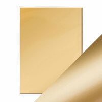
Next, I cut out two pieces of Tonic Honey Gold Satin Mirror Card in 4 ¼" x 4 ⅛" and 4 ¼" x 1" for the mat.
I flipped those two gold pieces over so they were facing the table and adhered the acetate between the two panels (facing outward) with Scrapbook.com ¼" clear double-sided adhesive.
With the panel still facing the table, I added some foam sheet pieces to the back of the gold panels to help secure everything and provide lift to the finished design. I peeled the backing from the foam piece at the bottom and adhered the trimmed card piece measuring 4 ¼" x 1" first before adhering the rest to the trimmed Neenah Vertical card base.
*Please note this product has been discontinued.
Card Making Tip: Measurements, cutting, and assembly on a cutout card can be a bit tricky, but if you take your time and make precise cuts, it will come out beautifully!
 The last step for this card was adhering the blended panel to the front. I cut this piece down to two panels measuring 4 ⅛" x 3 ⅞" and 4 ⅛" x ⅞" (you will have a little bit left over). I then adhered these on top of the gold cardstock, centering to create a thin, beautiful gold mat.
Card Making Tip: Be mindful about placement when stamping or writing your inside card sentiments - you don't want your beautiful acetate window marred by the contents inside the card! Stick to the very top of the card and you'll be just fine.
 For my second card design, I took a very different approach to this nostalgic style. Repeating geometric and abstract shapes in funky colors is a look used frequently in the Mid-Century Modern style. To recreate that kind of pattern, I used my stamp platform!
 I started with a piece of Neenah white cardstock and cut it to 3½" x 7½". I wanted my stamped images to be flush with the right side of the card, so I eyeballed the placement of the double petal stamp from the Mid-Century Floral set and drew a line down the cardstock using a Scrapbook.com Precision Point Journaling Pen and a ruler.
I covered up the left side of the line with some bright yellow masking paper and lined up the stamp at the bottom of the cardstock in the platform. Then, I was able to move the panel down the stamp positioner ½" at a time and stamp the next petal in the next color.
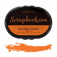
I repeated this process all the way to the top of the panel, randomly selecting from Lagoon Blue, Caribbean, Guacamole, Autumn Leaves, and Orange Cream hybrid inks.
Stamping Tip: Use Sizzix Sticky Sheets on your stamp platform base and you can set the magnets aside for this technique!
 Then, I moved the masking paper to the right side and repeated the stamping process on the left side. This time, I only used Lagoon Blue, which complemented all the colors I used in the last step.
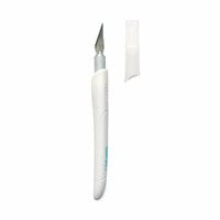
I randomly stamped, and gold heat embossed the crosshatch overlay image on some of the petals and used a craft knife to (carefully!) cut out a few of the petals on the left for an eyecatching feature.
 I stamped, and heat embossed a sentiment from the You and Me Quotes and Sayings Set on a piece of dark blue cardstock and adhered it near the top of the stamped panel.
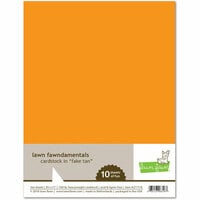
I really wanted some fun, colorful layers on this card, so I chose some cardstock that complemented the ink colors. I cut a piece of Gold Foil cardstock for the first layer in 3 ¾" x 7 ¾", Bazzill Dark Seas for the next in 3 ⅞" x 7 ⅞", and Lawn Fawn Fake Tan in 4" x 8".
 I made the card base with a piece of 8" x 8" Neenah white cardstock scored at the 4" mark to make a long, thin 4" x 8" card. I layered each of the colors of cardstock on top of each other with adhesive before attaching it all to the card base.

Card Making Tip: The We R Envelope Punch Board can help you make a perfect envelope for your 4" x 8" card using a piece of paper sized to 9 ⅝" x 9 ⅝". Use the 123 Punch Board to make a card envelope, gift box, and a bow for that special guy in your life!
 I hope my two card ideas helped you to think about fun color combinations and patterns along with easy techniques to use for showing the great guys in your life how much you love them.
 Thank you for following along with my projects today, and thanks to Scrapbook.com for asking me to share! Happy Anniversary, Scrapbook.com!

Looking for some more inspiration for card making? We have some amazing guest blog tutorials for making all your Christmas cards at once with a quick and easy assembly line and 10 fantastic techniques for using Stickles and Nuvo Drops in your handmade cards!