While I do love this, I'm with Brenda. Twelve is tough because there is that starting to be grown up feel that you want but it still has to draw in a twelve year-old. I also really like Tiff's idea to have your daughter do her own spin on a layout with the same photos. I do love the photo placement, the heart, the puzzles pieces...those are fabulous!
I'm loving the photo placement on this and that strip of photos is really a great touch! I really love how everything matches her outfit. Such a girl thing! lol I'm not sure about the top right corner though. The rest of the page features a lot of squares and then that corner is dots.. I don't know.. Could just be me.. Maybe if that paper was incorporated elsewhere..
Call me crazy (no to my face, silly woman), but I like this. Blue is sooooo amazingly calming though, that I could likely be hypnotized by it. The textures and graphics are cool and I like the photo booth prints. However, I can feel what Brenda is saying. You know what I would like to see. I'd like for her to do a LO with the same title totally her style. Then, to me it would be "the story of a girl" Mom's view looking in and "the story of a girl from Rachel's point of view. You could let her use the same pics, but place them and sort them as she likes. Just a thought. Always glad to see your work!
While I'm digging the photo placement, textures, and just the general format of the lo, I don't think it's a very youthful page for your daughter. Twelve, right? Rather than make suggestions on this one, I have an entirely different suggestion. I went back to your gallery and took another look at that My Space spread you did, and thought you should consider the same feel for the cover page. Something that attracts a pre-teen's attention and makes her want to open it up and go through it. Think of her friends ooh-ing and aah-ing and girlishly squealing to see what's inside. That may inspire you. As for the title, does she like No Doubt/Gwen Stefani? How about, "Just a Girl" or "I'm Just a Girl" ? I also love Nitza's ideas of printing the little pics in different colors. I'll pm you links of another idea I had, as well. Definitely save this lo for another page, though.
This is cute! I agree with making the center photo one picture. I really like those puzzle peices, they balance out the LO very nicely. The title is awesome, it looks like you used puffy paint. Im not to crazy about the photocorner either, and wondering if maybe you could make a heart using that fiber to go up there...
I love the colors and the title! The photo corner-you can cover it with a flower or make another photo corner.I think you should use all the photos , but use the big one as is, then you can turn the little once next to the big one black and white, and the photos on the strip you can do like first one B&W, second-sepia, and third-antique effect. Or fade the color on the first one , then use one normal and the 3rd one boost the color.I don't know if any of this will look good, but you can try. Now I think cover the corner with the tissue paper and put some of the mesh on top. O.K. I think I'll shut up now.Just throwing ideas at you. Can't wait to see the finished one!
Love how you did the title, the colors - the white and blues look fabulous together- and the darker tissue paper and how it's layered over the heart. Also, love the mesh...I like the textures here! I agree with others about having a large photo only (or the large photo and the right photo strip), on the cover. The other little photos can be used as a great accent elsewhere in the album. I like what you've done so far though!
I agree. I would just make that center photo one photo. Either cut it off, or make the pic a little bigger to fill up some space. love the title (what font is that?) love the little mesh piece and brad. i think it's a good title page
Love the sotry of a girl and the placement. I agree with you on the corner .. I am not in love with it. I think the middle large photo is good and the flimstrip. I would cut off the other photos in the center. Love the dots and everything else though. Placement rocks!
I really like the colours! I like how you have done the title and the little 'R' button is really cute! The brads on the photo look really good and the little heart - though it may be more noticible if it overlaps the pic. I do like the pic but something isnt right. Maybe if theres just one big one as its a front cover? A good start!
I'm having a tough time with this one. I really do like the colors and the techniques used. My thought is that as a cover page you may want a different photo, one that shows more "personality" like a casual pose for a first impression page. I do love the title and the presentation of the title, love the R in the circle too. Possibly a few flowers would help unless shes just not a "flowery" type. I think its a great start tho!
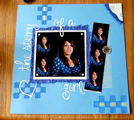
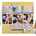
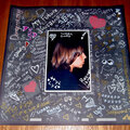
This is my tentative cover-page for her album... Not sure if it makes the right first impression and it was a quickie. Everything is glued/nailed down but I would still like any suggestions. I may have to do it over. I don't like the photo corner... don't know what I was thinking there...
Does this project or one of it's images contain pornography, profanity, or other illegal or offensive material? If so, please report it and our moderators will come by and clean it up in a flash.
April 30, 2007
April 14, 2007
April 12, 2007
April 11, 2007
April 11, 2007
April 11, 2007
April 10, 2007
April 10, 2007
April 10, 2007
April 10, 2007
April 10, 2007