Scrapbook.com Exclusives 20% to 60% OFF
Plus, Take 10% OFF Orders $100 or More! Use Code: CRAFTY
Plus, Take 10% OFF Orders $100 or More! Use Code: CRAFTY

 Give a Cheer
No products have been added to this project.


Thanks for spreading positivity!


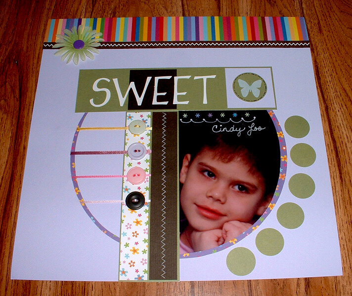
February 18, 2007
February 08, 2007
January 22, 2007
January 22, 2007
January 22, 2007
January 21, 2007
January 19, 2007
January 19, 2007
January 19, 2007
January 19, 2007
January 18, 2007
January 18, 2007
January 18, 2007