

Cheers
Give a Cheer

 Give a Cheer
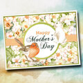
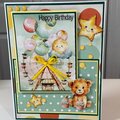
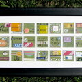
for SHCG BWC #6 Scraplift the person before you. I scraplifted Lisa's BD card http://www.scrapbook.com/galleries/184183/view/3105929/-1/1.html Thanks,Lisa!
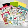
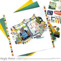
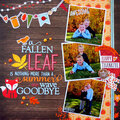
No products have been added to this project.
Thanks for spreading positivity!


April 20, 2011
April 14, 2011
April 02, 2011
March 28, 2011
March 26, 2011
March 15, 2011
March 15, 2011
March 15, 2011