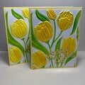
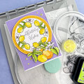
SHCG: This is a "sweet" page. The picture is adorable! The circles and fruit are great. I have to agree about the journaling suggested. At first glance I thought the owl was a drawing of someone with big eyes, arms out and a huge smile(which seemed to fit in with your "biased" opinion) A closer look showed a wise owl. Another stellar LO Brian.
SHCG: What a great retro page. The circles even remind me of wonderbread. GREAT use of negative space. Simple BUT complexin the choice of pattern papers, shapes, and placement. LUV it darling.
SHCG: I really like your overall placement of everything on this page... the circles are fun and the fruit and owl are great accents. I would have chosen more muted colors for the red circle and the two bright blue circles... they seem out of place with the softer colors. I think you've gotten some great ideas for where to place journalling; can't think of any other ideas. Excellent LO Brian!
SHCG - OMG, you ARE sweet, what a great pic. Love the use of negative space here w/ the off-center placement. The colors on the white background, plus the fruit, are fabulous. I agree w/ Brenda, if there's just a few lines of journaling, I can visualize it handwritten under "sweet." If there's more, I can see it on a bigger circle in the upper right - not in the extreme corner, nor right next to the pic, but somewhere in the middle so it works well focus-wise w/ the lovely pic/circles grouping you've already created. Incredible scrapping yet again, Brian!
SHCG: I love that you used sweet to describe the mini version of you, not biased at all! I also love your pp and fruit choices. I can see why you're still unsure about journaling placement. I came up with a few ideas myself. I can see journaling under Sweet if it's not too lengthy, and the date somewhere inconspicuous like in a circle or around the curve of a circle. If it's lengthy journaling, I wouldn't put it to the right of the photo as you are facing out of the page and it might throw off the balance. I've been seeing a lot of los lately that have a lot of negative space and the journaling is detached from the subject like high up in the right corner and in a skinny block. This could be tricky, too. Try writing it on some transparency scraps and place it over the page to test how you feel about the placement before you commit.
SHCG: Awe, it is very sweet-th epic and the lo! Love the circles and the stamped images, the pears and the apple! I like how you positioned the circles too! I think you can move the little red circle a bit more to the corner and cut a circle, put it right where the red circle is right now. Use the new circle for journaling and the date! And if that throws off the balance, you always can put the date right under the pic and journal on the back. Love it!
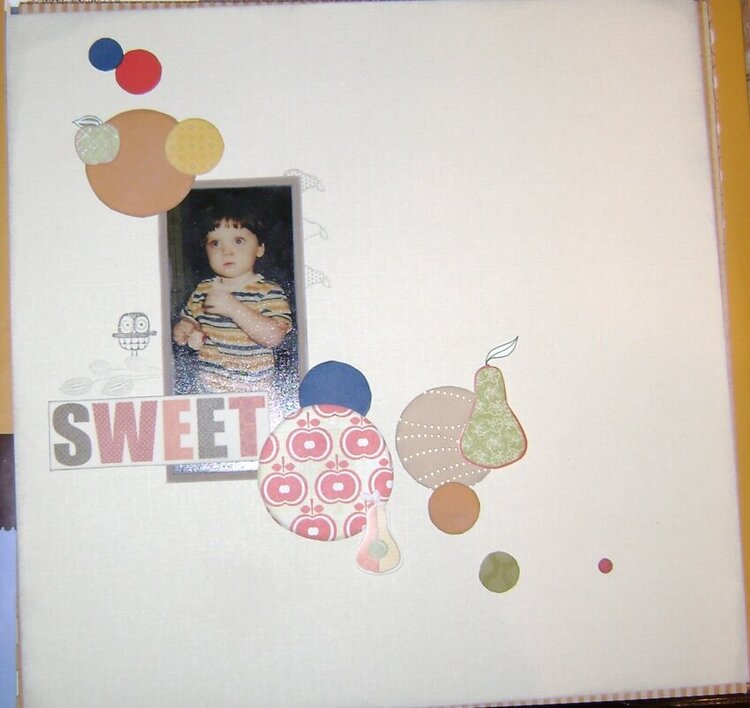
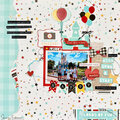
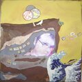
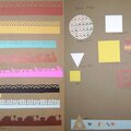
I'm still trying to figure out where to put the journaling and the date. This title might be a bit biased (since the photo is of me), but it went with the page well.
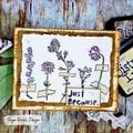
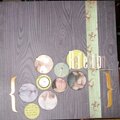
Does this project or one of it's images contain pornography, profanity, or other illegal or offensive material? If so, please report it and our moderators will come by and clean it up in a flash.
July 07, 2010
June 12, 2010
June 07, 2010
June 06, 2010
June 05, 2010
May 31, 2010
May 30, 2010
May 29, 2010
May 28, 2010
May 27, 2010
May 26, 2010
May 26, 2010
May 26, 2010