Memorial Day Weekend Savings!
FREE Standard Shipping on Orders $85+ with code: FREESHIPPING
FREE Standard Shipping on Orders $85+ with code: FREESHIPPING

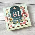
 Give a Cheer
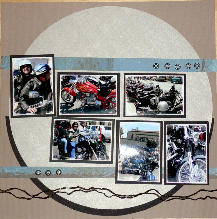
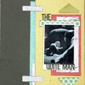
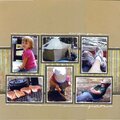
okay so nothing but the photo mats are glued down. im having issues with commiting on the lo....suggestions please
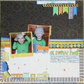
No products have been added to this project.


Thanks for spreading positivity!


September 28, 2007
September 17, 2007
September 16, 2007
September 15, 2007
September 14, 2007
September 14, 2007
September 14, 2007
September 14, 2007
September 14, 2007
September 14, 2007
September 14, 2007
September 14, 2007