SHCG: This layout is an amazing tribute and a perfect response to a BWC. I prefer the negative space created with the black and agree with a couple of others about perhaps not recording the names there. I can understand you wanting to put the names, I think hidden journaling or maybe another spot would work. I just wouldn't want to put too much on this area. I think it is perfect the way it is. Nice job.
SHCG: This was such a great idea and a perfect response to the challenge. I really like the idea of the flaps. I have no suggestions, but I do agree with Brenda about not adding the names to that space. It is so perfect the way it is.
SHCG: Actually, I think it's ironic that the two flaps didn't join up, because now the two big blocks seem reminiscent of the towers themselves, standing next to each other. Would you reconsider writing the names, and finding another place for them? Perhaps, inside the flaps? The way it is now is so much more dramatic, and it just seems appropriate to leave it this way. It has such impact as is. Your attention is directed toward the bottom of the page, and well, the towers collapsed downward. The way this lo was created embodies the symbolism I'm reading into it. The color scheme is perfect. Great interpretation of the BWC!
SHCG: Wow, this is a beautiful memorial. I love the black space on this page and think it makes your journaling on the bottom that much more impacting. I can see the names of the victims written in white on the top and feel that will be just as moving. Beautiul page!
this is amazing! really amazing. i actually LOVE all of that empty space up top, but i can also see it journaled beautifully with the names of those remembered. incredible tribute.
SHCG: what a wonderful response to the challenge. Love that all of the numbers are written in red. I really love all of the space at the top. Really love how you did your title. I really do not see a think I'd change. love it
SHCG - Incredible response to the challenge, QueenMel. I love your use of space. I agree w/ the poster below that the black flaps are reminiscent of the towers. Perfect colors. I think the combo of the timeline, w/ your handwriting, is striking to me. Now, you wrote in the SHCG thread that you didn't want to share the journaling partially because I'm a New Yorker; please don't let that stop you if you'd like to show it or even PM it to whoever. As not only a New Yorker but as someone who lost one of my best friends in this tragedy, I applaud you for memorializing this so amazingly. Wonderful work, Melissa.
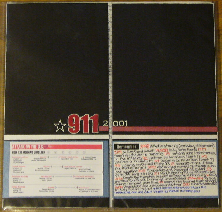
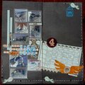
I did this to document 911 in my scrapbooks. It opens up to journaling and photos. I didn't realize when I made it that the flaps of the pp didn't line up flush with each other. Now I know though. I decided to leave the black area for now, it will be filled with the victims names at a later date.
Does this project or one of it's images contain pornography, profanity, or other illegal or offensive material? If so, please report it and our moderators will come by and clean it up in a flash.
April 06, 2008
March 03, 2008
March 03, 2008
March 02, 2008
March 01, 2008
February 29, 2008
February 26, 2008
February 25, 2008
February 25, 2008
February 25, 2008
February 25, 2008
February 25, 2008
February 25, 2008
February 25, 2008
February 25, 2008
February 25, 2008
February 25, 2008
February 25, 2008
February 25, 2008
February 25, 2008
February 25, 2008
February 24, 2008
February 23, 2008
February 22, 2008
February 22, 2008
February 19, 2008
February 19, 2008
February 19, 2008
February 18, 2008
February 18, 2008
February 18, 2008
February 17, 2008
February 17, 2008
February 17, 2008
February 17, 2008
February 17, 2008
February 17, 2008
February 17, 2008
February 17, 2008
February 17, 2008
February 17, 2008
February 17, 2008
February 17, 2008