

Thank YOU! It's Customer Appreciation Week!
EXTRA 11% OFF Orders $100+ With Code: THANKYOU
EXTRA 11% OFF Orders $100+ With Code: THANKYOU

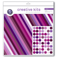
 Give a Cheer
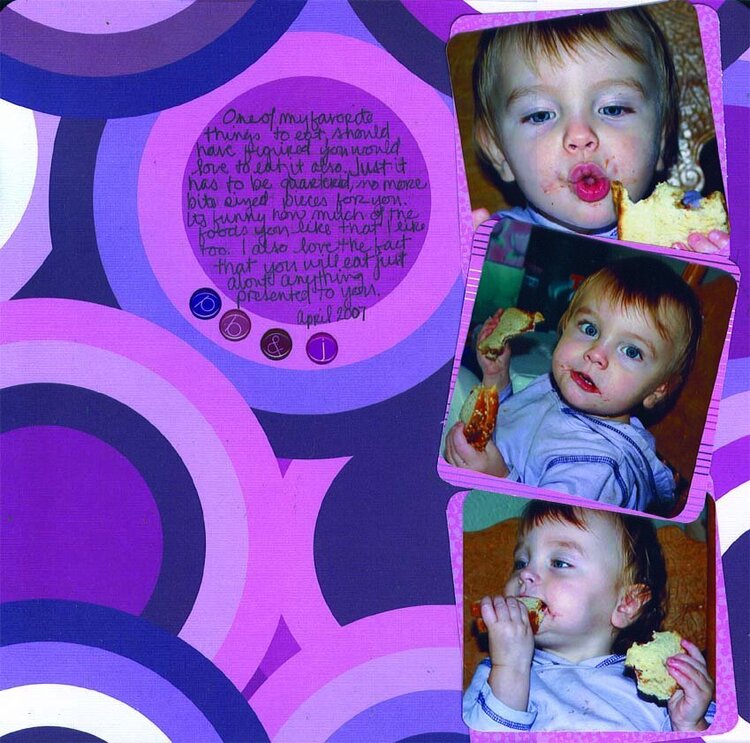
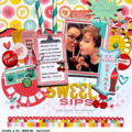
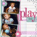
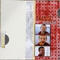
Just some fun shots of DD eating one of her favorite foods. And also the lo that made me realize I use my scrapbooks as a kind of visual journal. Thats me, and well I cannot for the life of me keep a written journal for more than a month, I've tried repeatedly

Thanks for spreading positivity!


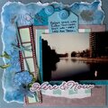
May 20, 2007
May 17, 2007
May 17, 2007
May 17, 2007
May 17, 2007
May 17, 2007
May 16, 2007
May 16, 2007
May 16, 2007
May 16, 2007
May 16, 2007
May 16, 2007
May 15, 2007
May 15, 2007
May 15, 2007
May 15, 2007